Beware of Choice Overload!
How Too Many Options Quietly Kill Your Website Conversions
Most websites don’t fail because the product is bad. They fail because the visitor lands, looks around, and thinks, “What the hell do I do next.”
And then they leave.
That moment is often the result of choice overload. Too much text, too many buttons, too many pages, too many “priorities” all shouting at once. It feels like you’re giving people freedom, but in reality you’re adding friction between curiosity and commitment.
This is where Hick’s Law comes in.

Hick’s Law is a principle from psychology and human–computer interaction that says:
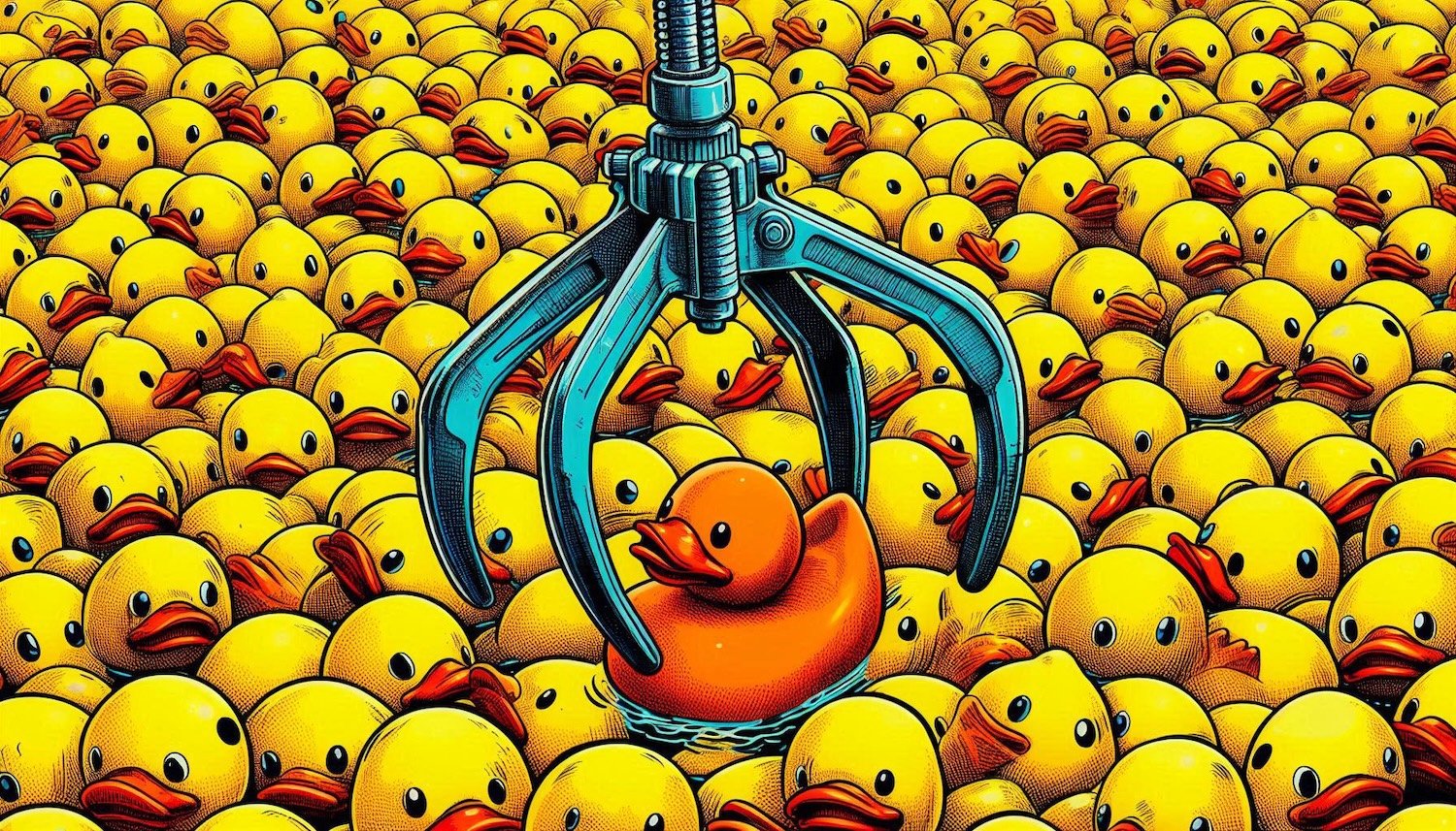
The more choices you offer someone, the longer they take to decide.
On a website, that delay is deadly. You don’t have minutes for people to think. You have seconds. Every extra decision, every extra link, every “learn more” that doesn’t really need to be there nudges users closer to the back button.
We see this a lot with growing businesses.
The instinct is to show everything: all services, all sectors, all case studies, all the clever stuff you’re capable of. You cram it into the navigation, stack it into the homepage, and layer it into the footer, “just in case”.
From the inside, that feels thorough. From the outside, it feels like work.
A better approach is to design for decisions, not for maximum exposure.
That starts with a blunt question:
What is the single most valuable action a visitor can take on this page?
It might be:
Book a call
Download a capabilities deck
View a flagship case study
Sign up to a newsletter
Once you know that, you can shape the page around it. Strip away competing calls-to-action, hide secondary paths behind clear labels, and use layout and hierarchy to make the “obvious next step” genuinely obvious.
This is Hick’s Law in practice: reduce the number of meaningful choices, so the user can move forward faster and with less friction.

Concrete examples:
Instead of five different “Get in touch” variants, use one button style, one label and one path.
Instead of dumping every service into the main nav, group them into one “What we do” area, then guide people through with clear headings and short copy.
Instead of eight hero buttons, use one primary action and, at most, one secondary for people who aren’t ready yet.
You’re not dumbing things down, you’re respecting cognitive load. Busy people, small screens, patchy attention. The simpler you make the decision, the more likely they are to make it.
The irony is, when you show less, you learn more.
A tighter set of calls-to-action gives cleaner analytics: you can see what’s working, optimise specific journeys and test changes without noise from a dozen competing clicks.
If your website feels busy, unfocused or “polite but forgettable”, there’s a good chance Hick’s Law is at play in the background. Too many choices, too much thinking, not enough doing.
Our job at Hiatus Design is to help you turn that around, cutting the clutter, clarifying the journey and designing for the decisions that actually grow the business.
You Might Also Like These Articles on Brand Design: