Escape the ‘Sea of Same’: How to Win the Fight Against Blending In

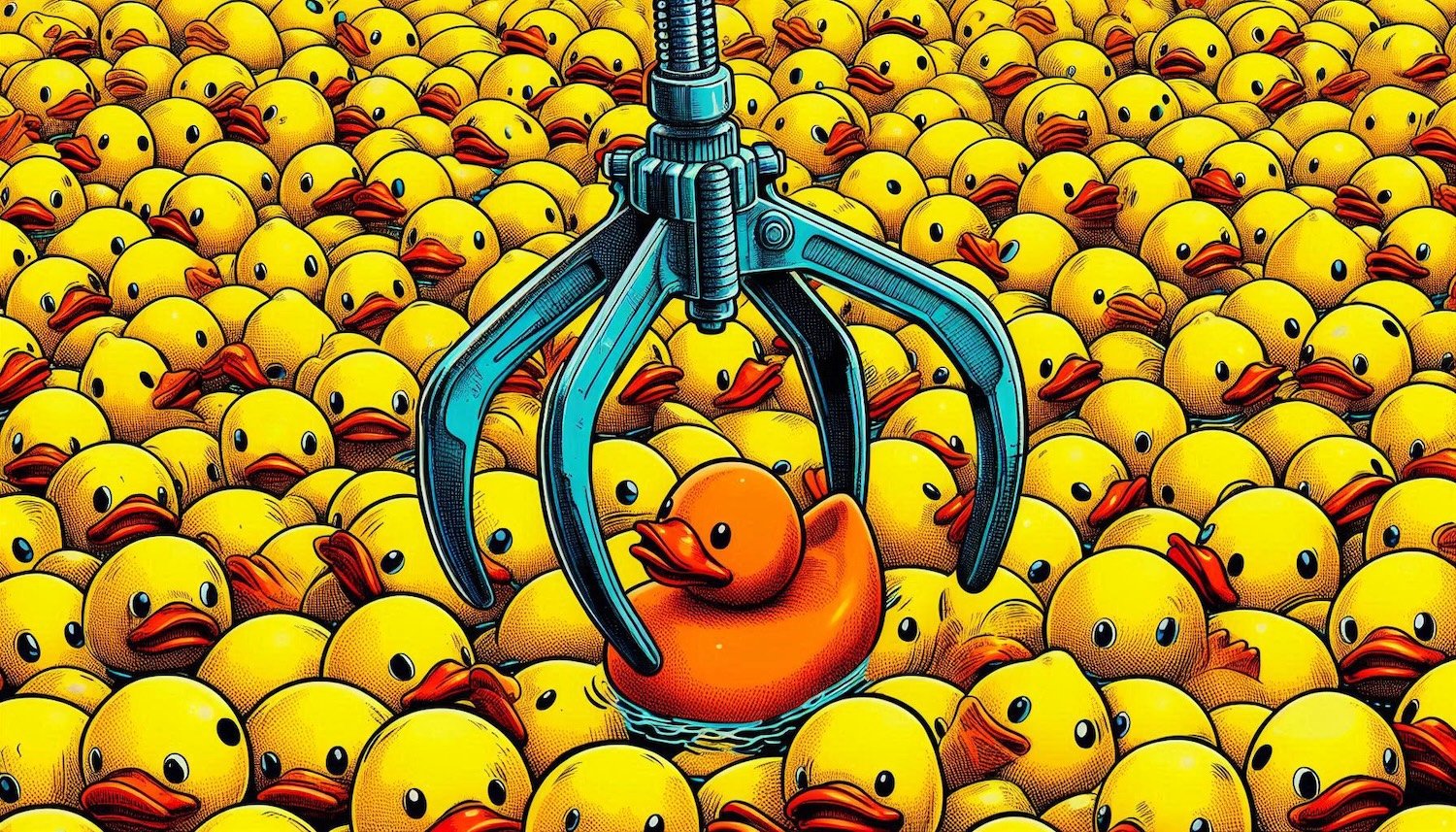
In Scale-Ups and Enterprise, there’s a silent killer of innovation, the “sea of same.”
It’s the point at which entire industries start to look, sound, and feel indistinguishable from one another. Sleek websites, minimalist logos, tired mission statements, they all start blending into a single, forgettable, bland blur. And if you’re not careful, your brand can sink in it too.
What causes the sea of same?
It usually starts with best practice overload. Brands look to market leaders for inspiration, and before long, everyone is borrowing from the same style guides, stock photo libraries, and brand templates. SaaS companies all use similar pastel gradients and geometric icons. Defence firms lean on light greys and sans serif type. Space tech ventures mimic NASA and SpaceX. Without knowing it, companies drift into sameness in the name of safety.
But the irony is, playing it safe is what makes your brand invisible.
At Hiatus, we work with organisations in complex, high-stakes sectors like defence, space, cybersecurity, and dual-use innovation. These industries face their own pressures: the need for trust, clarity, and compliance. But that doesn’t mean creativity is off the table, in fact, it’s more important than ever.
To stay afloat in the sea of same, here’s what we recommend:
1. Start with strategy, not aesthetics
Design should never be decoration. It should be rooted in what makes your company different, your mission, mindset, and market. If you’re just mimicking what others have done, you're already behind.
2. Dare to say something real
Most websites are packed with vague phrases like “cutting-edge solutions” or “tailored services.” Instead, say something that only your company could say. Use plain language. Speak with clarity. Be bold enough to have a point of view.
3. Design for your operators
Your users are often not marketing people, they’re engineers, mission planners, procurement teams, or frontline operators.
Good design meets them where they are. It should be fast, readable, and stripped of fluff.
4. Don’t be afraid of difference
Brands that stand out often do so because they break one or two conventions, a striking colour, an unexpected tone of voice, or a radically simplified layout. That moment of surprise is what makes people remember you.
5. Refresh regularly
Digital fatigue is real. The internet never stands still. If your website or product design hasn’t been updated in 3–4 years, you might already be fading into the background. Don’t wait for it to become a problem.
The sea of same isn’t just a design issue, it’s a business risk. If your customers can’t tell you apart from the rest, why would they choose you?
At Hiatus, we design for clarity, impact, and difference. If you’re building something important, it deserves to be seen.
When it comes to website security, everything valuable stays locked inside, with clear rules on who can enter and when. But just like with real fences, it’s the gaps, the loose panels, rusted locks, and overlooked corners, that become entry points for trouble.
A powerful planning concept our founders learned whilst serving in elite units of the British military, red teaming is a practice used to challenge assumptions, stress-test plans, and uncover vulnerabilities before they’re exploited.
Originally formulated by Robert Metcalfe to describe the impact of networking in telecommunications, Metcalfe’s Law states that the value of a network is proportional to the square of the number of connected users. But in the 21st century, the principle has since been applied to social media, digital platforms, and even websites.
Branding is much more than just a logo or a catchy slogan. It is the essence of your business, encompassing everything from your visual identity to the way you communicate with your customers.
At Haus of Hiatus, we believe that effective branding is the key to building a strong, recognisable, and trustworthy business. This is achieved through the principles of associative learning, the law of least mental effort, and the mere exposure effect.
In today's dynamic marketplace, the most resilient companies continually seek innovative strategies to expand their reach and enhance their brand portfolio.
One such strategy we often recommend in our marketing audits, is the creation of satellite brands. But what exactly is a satellite brand, and how can it benefit your parent company?
If you’ve not heard of a satellite brand, it’s an extension or offshoot of a larger, more established parent brand. While it operates with a degree of autonomy, it remains closely associated with the main brand, benefiting from its resources, reputation, and market presence.
You may not realise it, but at the core of your website and brand is a 'design system,' a method of understanding that helps to harness principles like the Aesthetic-Usability Effect, Jakob's Law, Law of Least Mental Effort, Law of Similarity, Serial Position Effect, and the Von Restorff Effect.
In this article, we’ll delve deeper into how these psychological and neurological phenomena intersect with design systems, reshaping the landscape of your website and brand experiences.
In cognitive psychology, "chunking" refers to the process of breaking down information into smaller, more manageable units – so that they can be recalled quicker.
This concept has significant implications for website design and user experience (UX), as it directly impacts how visitors perceive and interact with your online content.
“One of the most common pitfalls we've observed is the indiscriminate dumping of text onto the website without proper consideration for its relevance or impact.”
If you didn’t realise, your website is the digital storefront of your brand, the virtual gateway through which potential customers interact with your business.
It's a powerful tool for conveying your brand message, generating leads, and driving conversions. However, entrusting the user experience design of your website to lazy or inexperienced marketers can have disastrous consequences.
In today's competitive market landscape, a brand refresh is often the key to staying relevant and resonating with evolving consumer preferences.
However, the success of such an endeavour hinges on more than just a fresh coat of paint; it requires strategic planning, thoughtful execution, and perhaps most importantly, the active involvement of all stakeholders from the outset.
Designing a colour palette for a website is a crucial aspect of creating a visually appealing and cohesive brand experience.
One effective approach to achieving balance and harmony in colour selection is the 60/30/10 rule. This rule dictates that 60% of the colour scheme should be the main colour, 30% the secondary colour, and 10% the accent colour. Here's a detailed guide on how to implement this rule effectively:
Brand signposting is a critical part of a business's visual identity.
But what is it?
It’s all the elements that communicates the company's market position and target customer - that is the logo, taglines, colour palettes, and design systems, to name a few of the main components.
However, striking the right balance in brand signposting is essential, as too much or too little can both pose challenges for start-up and scale-up businesses.
When we’re working with ambitious scale-ups striving to increase their market position by communicating a higher level of professionalism, we naturally come around to the idea of rebranding as a method to get to that next level.
But it’s not straight forward, especially for companies that started off as single-person entity without a clear idea of whether the idea would work.
This is where a change in personality comes in.
In the ever-evolving realm of digital design, the concept of skeuomorphism has emerged as a key principle shaping user experiences. But what exactly is skeuomorphism, and how should it influence your approach to crafting digital interfaces?
Brand position is a crucial aspect of establishing a strong market presence and forging meaningful connections with consumers – that much is obvious. If your branding causes confusion or you’re sending more attention to your competitors, then it’s going to hurt your company’s bottom line.
So how do you find your unique and defensible market position?
Identify and catalogue the semiotic signs of it.
In the world of branding and design, making your product or message stand out is a perpetual challenge.
The Von Restorff Effect, also known as the Isolation Effect, is a psychological principle that can be a game-changer for brands seeking to capture the attention of their audience. This intriguing phenomenon offers insights into human cognition and memory, making it a powerful tool for marketers and designers alike.
But how does it help develop your brand? Here’s our thoughts:
Traditionally, brand ambassadors were often high-profile celebrities or influencers, but a new paradigm has emerged. Your own staff, the people who work behind the scenes, are now recognised as some of the most powerful and authentic brand ambassadors a company can have.
When you think about it, it makes perfect sense. Your employees are the heart and soul of your organisation. They interact with customers, collaborate with partners, and shape the culture of your company.
Your brand is your identity, that intangible power to stir emotions in peoples’ minds.
It's the sum total of all the exposures, impressions, interactions, and experiences people have with your brand. When your brand is well-established, it becomes a household name, making it easier for customers to choose your products or services over competitors'.
But building a brand is not just about having a snappy logo or a catchy tagline; it's about creating brand awareness and perception that is so pervasive that your brand seems to enter the room before you even get to the front door. If you want a brand to be successful, you have to make sure people know who you are.
In today's ever-evolving business landscape, the fate of many brands lies in a precarious balance. Some brands thrive and flourish, while others wither away into obscurity, becoming what we call "graveyard brands." These are brands that have failed to adapt to changing consumer preferences, technological advancements, or market dynamics.
To avoid becoming a graveyard brand, companies must adopt a proactive approach to brand design and growth marketing.
Whenever we’re designing a brand or running a rebranding project, a profound Japanese philosophy guides our approach: Genchi Genbutsu – which translates as "go and see for yourself" or "go to the source,".
This principle is the cornerstone of how we reshape and redefine brands. Originally pioneered by Toyota as their production system, Genchi Genbutsu transcends industries, offering a transformative methodology that goes beyond the surface to unearth the essence of your brand by seeing and experiencing the culture of your organisation. We find the best way to communicate it, is to first experience it!
We often get asked what the difference is between a graphic designer and a brand designer, so we decided to answer it on our website.
Whilst they might sound very similar, they are actually hugely different in function:
Building a compelling website is crucial for an ocean rowing team embarking on a 3000-mile journey across the Atlantic. By choosing a memorable domain name, selecting a suitable platform like Squarespace, customising the design, creating essential pages, sharing expedition information, maintaining an active blog, integrating social media, implementing donation options, optimising for SEO, testing and refining, promoting the website, and tracking analytics, the team can engage their audience, attract sponsors, and provide a central hub for updates and information. Ultimately, a well-managed website reflects the spirit and goals of the expedition, ensuring its success and impact.
Discover the secrets to designing an impactful logo for your expedition!
From understanding your mission to selecting the perfect typography and colours, this guide provides step-by-step instructions.
Build a strong brand identity that captivates investors and attracts sponsors. Unleash your expedition's potential with a memorable logo that embodies your values and excites your audience. Don't miss out on this essential resource!
Embarking on the Talisker Whiskey Atlantic challenge but feeling lost about where to begin? Don't worry, we've got you covered!
Before you start chasing investors or shopping for gear, focus on one crucial aspect: your team's branding. Discover why a strong brand identity is essential for ocean rowing teams and follow our step-by-step guide to designing a captivating brand that attracts investors and sponsors and sets you apart from the competition.

About the Author:
Chris is the founder of Hiatus.Design, a mission-driven branding and website design company that works with clients all over the world.
Over the course of his life, he has travelled to more than 60 countries across six continents, earned two Guinness World Records, completed the legendary Marathon des Sables, summited Mont Blanc and unclimbed peaks in Asia, become a Fellow of the Royal Geographical Society (FRGS), rowed across the Atlantic Ocean and obtained a Masterʼs degree in Business Management (MA).