WTF is ‘Vibe Marketing’ and How Do You Use It to Grow?

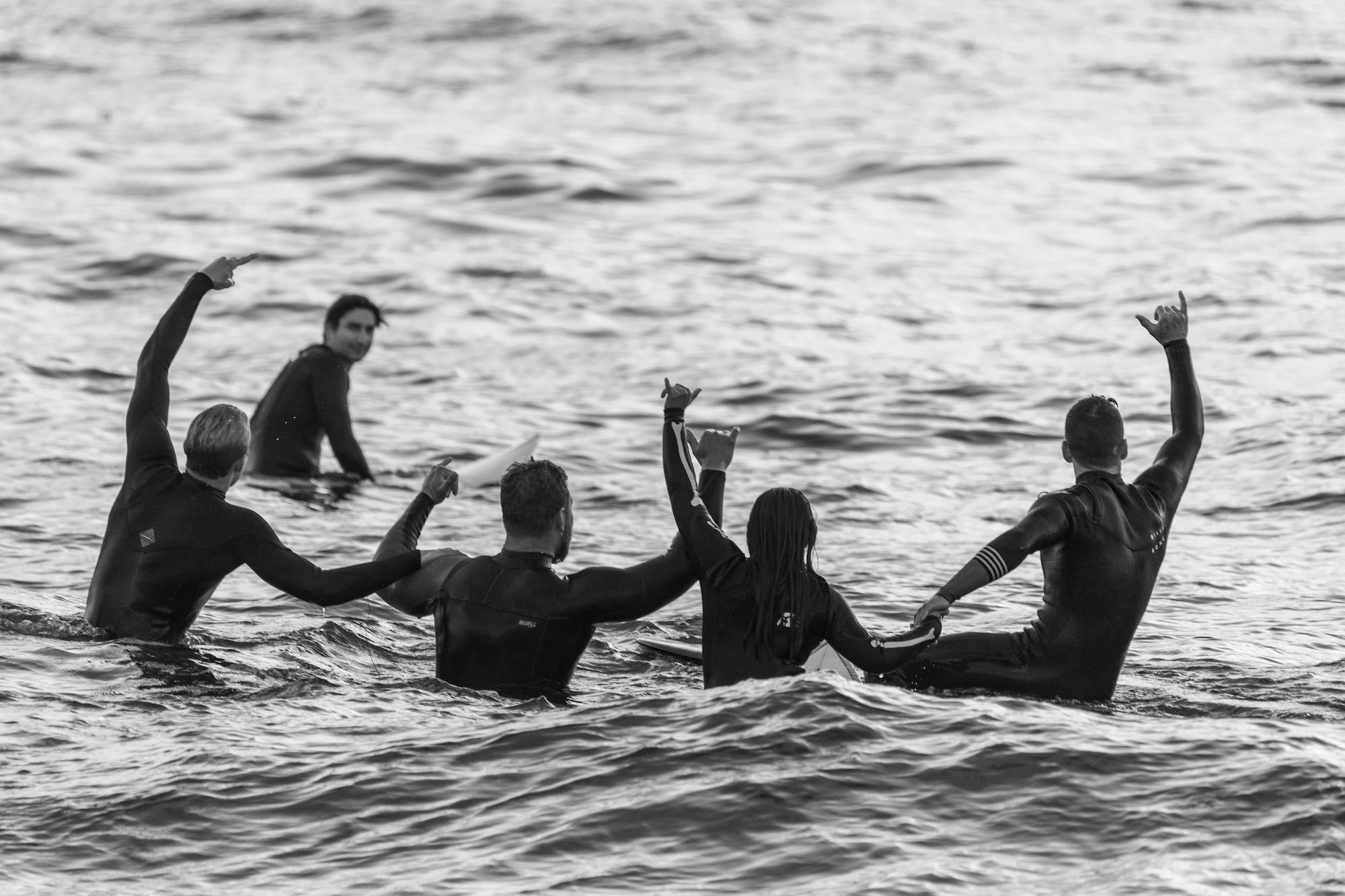
In the digital noise of the 21st century, the brands that stand out aren’t always the loudest, they’re the ones that feel right. This is ‘vibe marketing’: a subtle but powerful approach that focuses less on selling features and more on creating a feeling.
Vibe marketing is about cultivating an atmosphere, the mood, energy, and aesthetic that people associate with your brand. It’s the reason why certain coffee brands feel like creativity in a cup, or why a tech start-up's website makes you feel like the future just arrived.
It's emotional, not transactional. It’s the brand equivalent of walking into a room and instantly knowing you belong.
Why It Matters
Today’s audiences, especially Gen Z and millennials, aren’t buying products, they’re buying belonging. They want to resonate with a brand’s values, its aesthetic, its sense of humour, even its imperfections. If your brand feels sterile or overly polished, it can come across as inauthentic. But if it has a vibe , a mood that aligns with your audience's identity , you're no longer interrupting their world, you're part of it.
At Hiatus.Design, we often see that the brands with the strongest visual presence aren’t necessarily the biggest, they’re just the ones who’ve figured out how to own a vibe.
What Does Vibe Marketing Look Like?
It might mean a website that feels like an interactive zine instead of a corporate brochure. It could be brand colours that break convention, or a tone of voice that’s uncomfortably honest, in the best way. Vibe marketing shows up in the micro-details: the way a loading screen makes you smile, the sound design in a launch video, the typography on a product box.
Importantly, it’s not just about aesthetics. Vibe is strategy. It’s intentional, and when done well, it builds long-term loyalty, even community.

How to Build Your Brand’s Vibe
1. Start with identity, not features
What does your brand feel like? Is it bold, quiet, nostalgic, irreverent?
2. Curate everything
From music and photography to motion and microcopy, every touchpoint should reinforce the same mood.
3. Design for a tribe, not the masses
Vibe marketing works best when you speak directly to a specific type of person, and exclude everyone else.
4. Stay consistent, but not static
A great vibe evolves. Your brand should grow like a person, not just a product.
Vibe marketing isn’t a gimmick, it’s what separates forgettable brands from cult favourites. At Hiatus.Design, we help adventurous brands get their vibe right from day one or recalibrate when things feel a little off.
Because when your brand has a vibe, people don’t just notice.
They feel it.
You might also like:
If your website looks good but isn’t being found on Google, you are not alone. Many SMEs invest in a smart design, publish a few core pages, then wait for traffic that never really arrives. The problem usually is not the design, it is discoverability.
Most websites don’t fail because the product is bad. They fail because the visitor lands, looks around, and thinks, “What the hell do I do next.”
That moment is often the result of choice overload. Too much text, too many buttons, too many pages, too many “priorities” all shouting at once.
This is where Hick’s Law comes in.
When was the last time you truly looked at your website as someone visiting for the first time?
It’s easy to forget that what feels intuitive to you might feel confusing, slow, or even frustrating to someone else. That’s where a usability audit comes in.
Your website isn’t just a digital shopfront, it’s your best salesperson.
It works 24/7, never takes a holiday, and shapes your customer’s first impression long before they speak to you.
When attention spans are short and options are endless, your site has just a few seconds to make someone feel they’ve come to the right place.
When visitors land on your website, you have less than five seconds to make a good impression.
In that tiny window, they’ll decide whether to stay or go.
And the first thing they read, is your hero tagline, that tells people who you are, what you do, and why they should care. If it’s vague, full of jargon, or simply missing, you’re wasting prime digital real estate.
When it comes to website security, everything valuable stays locked inside, with clear rules on who can enter and when. But just like with real fences, it’s the gaps, the loose panels, rusted locks, and overlooked corners, that become entry points for trouble.
A powerful planning concept our founders learned whilst serving in elite units of the British military, red teaming is a practice used to challenge assumptions, stress-test plans, and uncover vulnerabilities before they’re exploited.
Originally formulated by Robert Metcalfe to describe the impact of networking in telecommunications, Metcalfe’s Law states that the value of a network is proportional to the square of the number of connected users. But in the 21st century, the principle has since been applied to social media, digital platforms, and even websites.
You may not realise it, but at the core of your website and brand is a 'design system,' a method of understanding that helps to harness principles like the Aesthetic-Usability Effect, Jakob's Law, Law of Least Mental Effort, Law of Similarity, Serial Position Effect, and the Von Restorff Effect.
In this article, we’ll delve deeper into how these psychological and neurological phenomena intersect with design systems, reshaping the landscape of your website and brand experiences.
In cognitive psychology, "chunking" refers to the process of breaking down information into smaller, more manageable units – so that they can be recalled quicker.
This concept has significant implications for website design and user experience (UX), as it directly impacts how visitors perceive and interact with your online content.
“One of the most common pitfalls we've observed is the indiscriminate dumping of text onto the website without proper consideration for its relevance or impact.”
If you didn’t realise, your website is the digital storefront of your brand, the virtual gateway through which potential customers interact with your business.
It's a powerful tool for conveying your brand message, generating leads, and driving conversions. However, entrusting the user experience design of your website to lazy or inexperienced marketers can have disastrous consequences.
At its core, choice architecture uses principles from behavioural economics and social psychology to nudge users towards making decisions that align with their goals and preferences.
By strategically structuring options and information, we can guide users towards desired actions and outcomes, ultimately enhancing the effectiveness and usability of your website.
Designing a colour palette for a website is a crucial aspect of creating a visually appealing and cohesive brand experience.
One effective approach to achieving balance and harmony in colour selection is the 60/30/10 rule. This rule dictates that 60% of the colour scheme should be the main colour, 30% the secondary colour, and 10% the accent colour. Here's a detailed guide on how to implement this rule effectively:
In the ever-evolving realm of digital design, the concept of skeuomorphism has emerged as a key principle shaping user experiences. But what exactly is skeuomorphism, and how should it influence your approach to crafting digital interfaces?
In the world of branding and design, making your product or message stand out is a perpetual challenge.
The Von Restorff Effect, also known as the Isolation Effect, is a psychological principle that can be a game-changer for brands seeking to capture the attention of their audience. This intriguing phenomenon offers insights into human cognition and memory, making it a powerful tool for marketers and designers alike.
But how does it help develop your brand? Here’s our thoughts:
Building a compelling website is crucial for an ocean rowing team embarking on a 3000-mile journey across the Atlantic. By choosing a memorable domain name, selecting a suitable platform like Squarespace, customising the design, creating essential pages, sharing expedition information, maintaining an active blog, integrating social media, implementing donation options, optimising for SEO, testing and refining, promoting the website, and tracking analytics, the team can engage their audience, attract sponsors, and provide a central hub for updates and information. Ultimately, a well-managed website reflects the spirit and goals of the expedition, ensuring its success and impact.
About the Author:
Chris is the founder of Hiatus.Design, a mission-driven branding and website design company that works with clients all over the world.
Over the course of his life, he has travelled to more than 60 countries across six continents, earned two Guinness World Records, completed the legendary Marathon des Sables, summited Mont Blanc and unclimbed peaks in Asia, become a Fellow of the Royal Geographical Society (FRGS), rowed across the Atlantic Ocean and obtained a Masterʼs degree in Business Management (MA).


