Client: Sygneus
Project: Brand Redesign
Unlocking Commercial Momentum Across Deep Tech, Defence, and Advanced Engineering
In Winter 2025, we had the pleasure of working with Sygneus, a commercial growth partner for deep-tech innovators, to deliver a full brand refresh, expanding their logo, visual personality, iconography, and market communication language.
Working closely with Jack and the Sygneus team, the project began with a deep dive into the business itself, not just what Sygneus does, but how it operates day to day and the environments it works in. Understanding their role as an embedded commercial partner in deep-tech and regulated markets shaped every creative decision that followed.
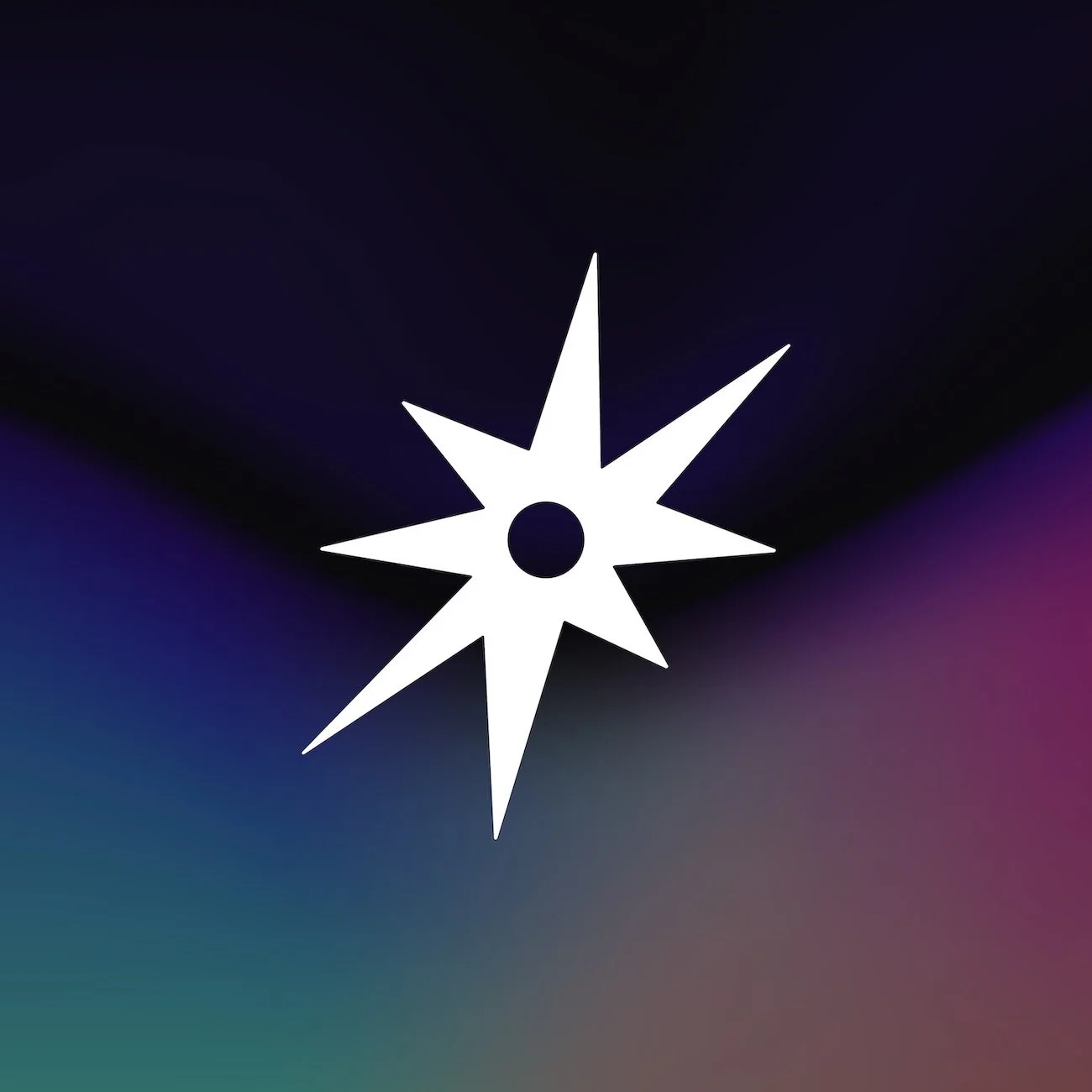
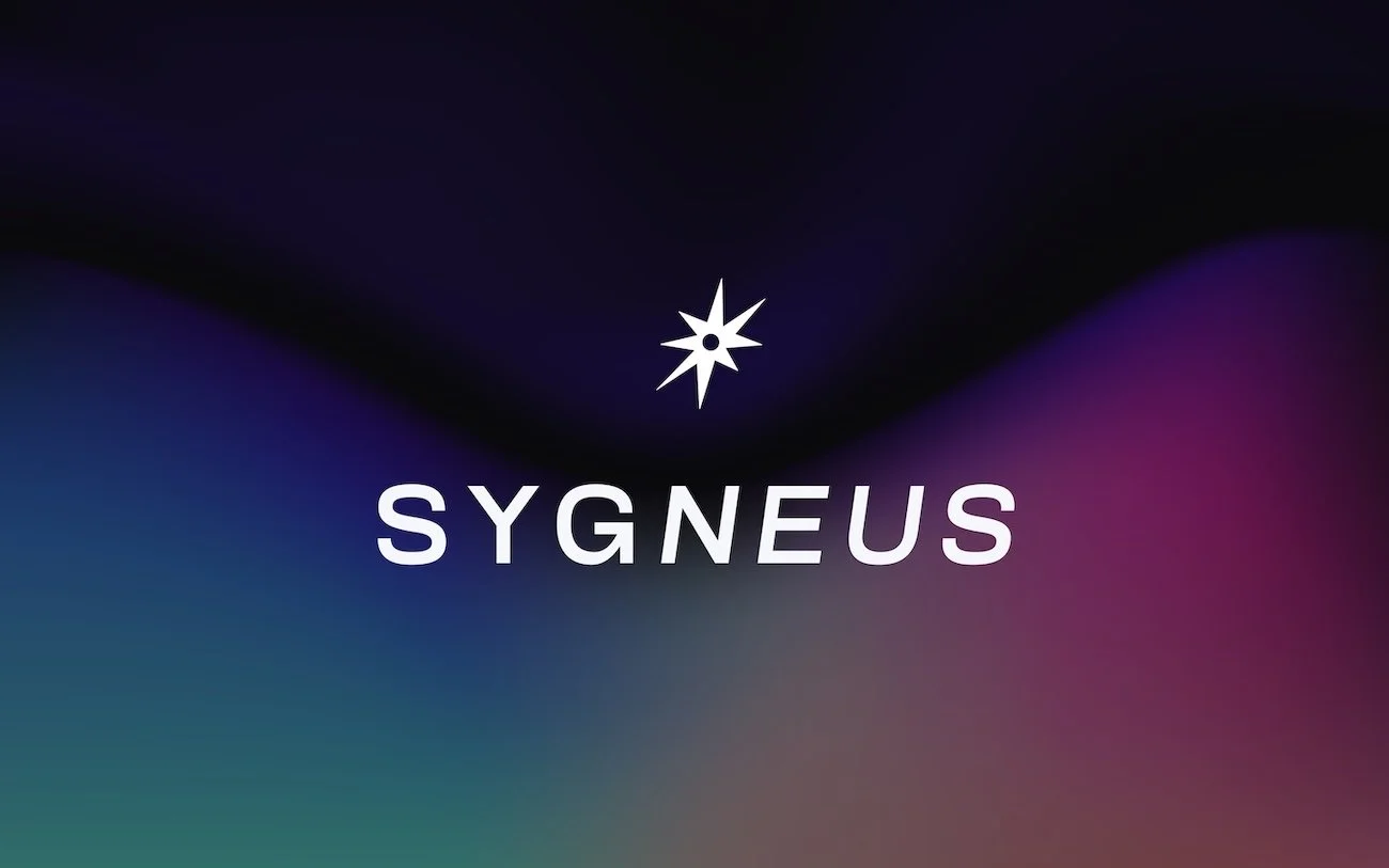
Logo evolution
Rather than starting from a blank slate, we treated the logo as an asset to be evolved. Early exploration focused on balance, how the mark could feel precise and engineered, while still conveying momentum and growth. We tested variations in weight, geometry, spacing, and proportion to ensure the logo could flex across digital platforms, proposals, and investor-facing material without losing clarity or authority. The final mark feels more confident and more contemporary, with a structure that reflects both technical rigour and forward motion.
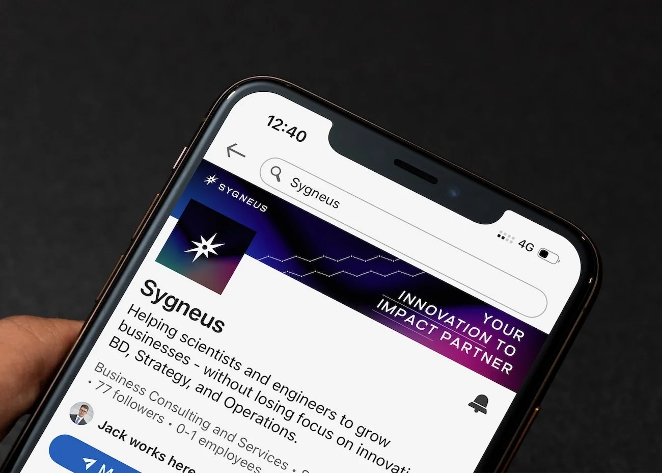
Brand pattern system
To support the logo, we developed a custom brand pattern inspired by systems thinking, networks, and signal flow, concepts that sit naturally within defence, nuclear, robotics, and advanced technology sectors. The pattern was designed as a modular system rather than a fixed graphic, allowing it to scale, fragment, and animate across different touchpoints. This gave Sygneus a visual language that could add depth and texture without overwhelming content or compromising legibility.
Service iconography
With Sygneus offering a growing suite of services and toolkits, clarity was critical. We designed a bespoke icon set built on the same geometric rules as the logo, ensuring consistency across the brand. Each icon was stripped back to its essential forms, prioritising recognition and meaning over decoration. This system allows services to be clearly signposted across the website, decks, and sales material, while reinforcing the overall visual coherence of the brand.
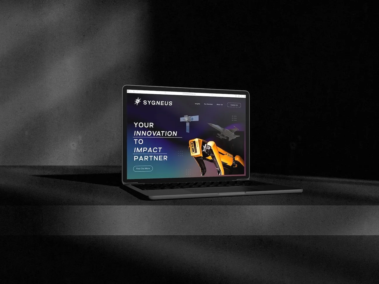
Brand imagery
Alongside the core identity, we created a library of brand imagery designed to bridge the gap between abstract technology and real-world application. Using a mix of commissioned visuals, curated photography, and graphic treatments, we established an image style that feels technical, human, and grounded. The imagery avoids clichés, focusing instead on atmosphere, scale, and context, reflecting the environments Sygneus operates in rather than over-literal representations of technology.
Brand guidelines
To bring everything together, we delivered Sygneus’ first comprehensive set of brand guidelines. These documented not just how the brand looks, but how it should be used in practice, covering logo usage, colour, typography, pattern application, iconography, imagery, and tone of voice. Designed to be clear and usable, the guidelines give Sygneus a practical framework to maintain consistency as the team grows, new partners come on board, and the brand expands into new markets.